
City Riders Bus App Prototype
Introduction
CLIENT OVERVIEW: The transportation agency for a midsize metropolitan area in the Midwest operates a network of public buses. They currently list expected bus schedules, but times are not live and are rarely accurate. The agency has developed a technology to know how far away each bus is from a stop, but they aren't sure how to share this information with riders.
PROBLEM: The transportation agency recently introduced route expansions which has increased the number of buses stopping at the same stop, causing challenges to riders determining which bus to take. The agency has also noticed their estimated bus arrival times have been inaccurate due to traffic, service impacts, etc, causing the rider experience to be unreliable.
ASK: The city would like to alleviate rider confusion and frustration by building an app to allow riders to (1) view future arrival times for each bus line, (2) know how much time they have to get to their stop, and (3) view when each bus arrives at each stop.
AUDIENCE: The main audience for this project are city and suburban commuters that ride the bus daily to get to and from work. These riders need a reliable bus schedule that is accurate and easy to access/use in order to get to work on time. They are accustomed to using technology and apps to make life easier.
PROJECT SCOPE: Project duration was four weeks. Project scope was limited to developing the minimum viable product (high fidelity prototype) to address requirements. Additional follow on work may be awarded for future functionality.
PROCESS: For this project I used a double diamond framework with four key phases; discover, define, develop, deliver. During the discover phase, I conducted research about public transportation riders and existing technology to learn more about the typical public transportation commute (i.e. pain-points), which generated valuable insights (i.e. personas, recommendations) to guide design. In the define phase, discovery inputs were used to create user flows and first wireframe iterations. In the develop phase, wireframes were refined and branding & visual design including typography, color, etc. were applied to create high-fidelity prototypes. Finally in the deliver phase, prototype usability testing was conducted. Results were analyzed and used to inform the final delivery of the app.
Discover
This phase was all about research. I began by conducting a competitive analysis with other metropolitan transportation apps including Google Maps & DC Metro. The strengths and weaknesses of these apps guided prioritization of the MVP and potential future prototype features.
I then surveyed users representative of our target demographic. Survey results provided insight into user demographics, behaviors, and needs.


User surveys also helped to shape two key personas; Javier and Colby.
Javier the Commuter is primarily concerned with planning his daily commute. He knows the stops and routes like the back of his hand, but really needs an app with reliable schedules and arrival times to get him to work on time.
Colby the Explorer, loves to try new things and rarely visits the same place twice. Because she only knows her destination, she needs a feature to plan her trip itinerary.

Note: This image depicts a summary of the personas created for the Discover phase
The client requirements for this prototype prioritized the needs of Javier, but because Colby is also a key target user of this product, I worked to incorporate some of Colby’s needs into the design as well.
Define
In this phase, discovery outputs were used to craft user stories. Although many user stories were thrown against the wall, due to alignment with requirements and satisfying key persona needs, three user stories were prioritized and used to create user flows.
Develop
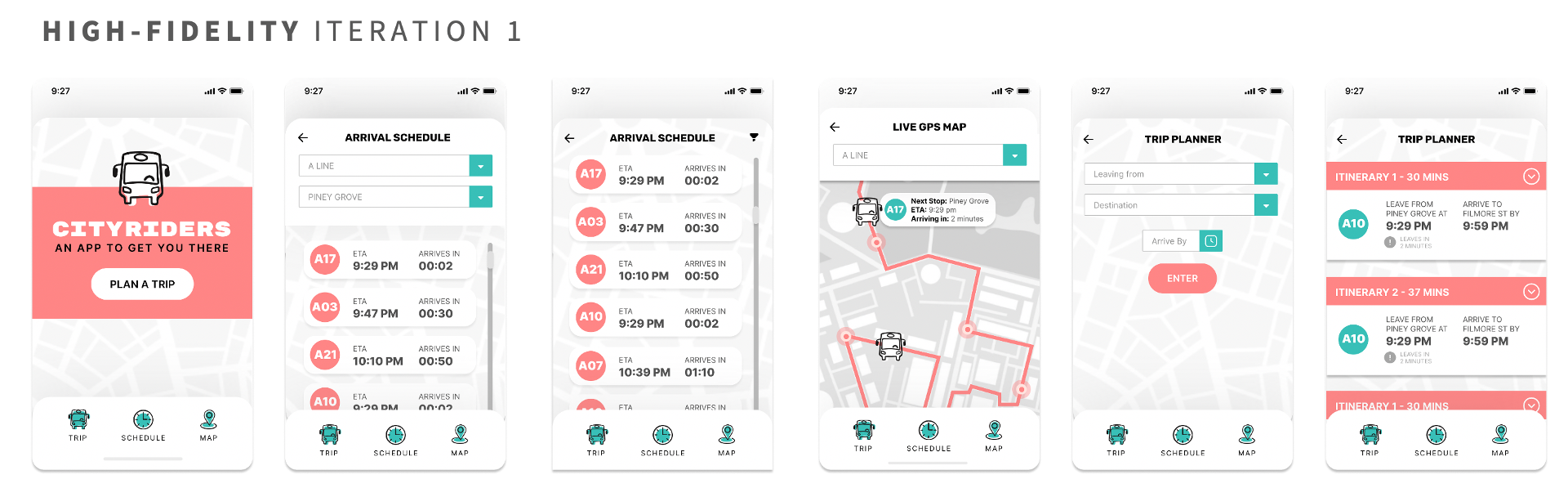
This phase kicked-off with wire-framing. Based on the user flows, I designed three key features;
Live Bus Schedule
Trip/Itinerary Planner
Live GPS Map
Once the wireframes were built, we conducted a brief round of user testing. As shown below, quite a few updates were made to the wireframes including:
More focused homepage on key app feature; live schedule
Better use of grids, whitespace, visual hierarchy
Added tap bar pattern (bottom navigation) with most common first-level actions to click
Exit paths on all pages below Welcome page
Additional detail; filtering & expanding
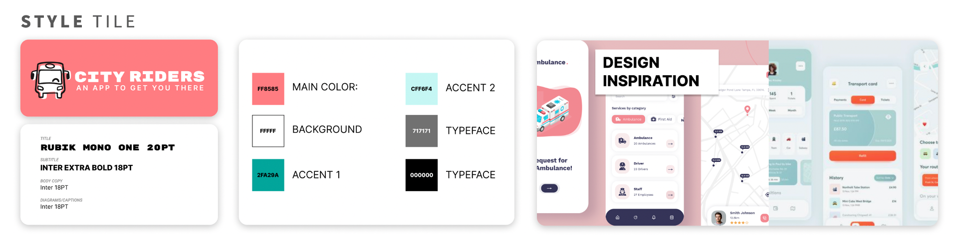
After sign-off on the wireframes, the next step was to incorporate a visual design and branding strategy. The agency was looking to reinvent themselves to be a more modern, fun, energetic, and reliable brand. With that in mind, I did some digging for design inspiration and then crafted a style tile. I proposed a color scheme that was vibrant and warm red tones to represent the energetic and urgent brand characteristics, balanced with more calming blue-greens.
The typography and logo were also a balancing act. The logo provides a more fun, informal look and feel to attract our target demographic, but we chose clean, simple and modern title and body fonts for balance.
After approval, I layered the visual design elements onto our wireframes to create the first iteration of high-fidelity prototypes.
Deliver
In the last phase, I conducted usability testing to ensure the app design satisfied the MVP requirements while meeting usability and user experience standards. Five testers were asked to navigate and locate key app features, share their thoughts on the experience (positive & negative), and share motivations behind certain behaviors especially when running into a roadblock.
After observing tester behaviors and interactions, and analyzing feedback, the following usability and visual enhancements were incorporated into the final prototype design.
Trip Planner Itinerary: default to collapsed, update collapse arrows, move late arrival alert to front, add red/yellow color
Live GPS Map: Make the bus seem more like a button that expands with detail, put search drop down destination first
Arrival Schedule: Change A Line to something more obvious - bold or symbol, show stop at top or direction of bus
General: All bus # should be same color for consistency if there is no association of lines to colors, grays are too light, buttons/drop downs same colors
The final MVP prototype turned out like this:

Final Thoughts
This was my first project using a double-diamond design thinking approach. The problem laid at the foundation of the design, but the user is what helped to shape it. By conducting user research, and imagining a product beyond the original client requirements through convergent and divergent thinking, I was able to deliver a prototype that met the core needs of our target users and satisfied client requirements, scope and budget.